07. Slack Card
Slack Card
Slack is a popular chat platform.
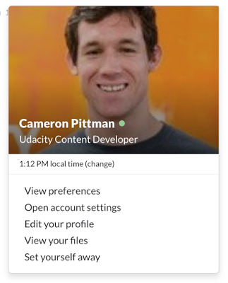
A Slack channel usually shows a list of names and their messages. If you click on someone's name, you'll see a card pop up that looks something like this:

Cameron's profile card looks great, but this one does not.
For this excercise, we've given you the code for that site in your own workspace. Your goal is to make it look more like a Slack profile card.
Here are some things to consider fixing:
- The buttons are very blocky. Change the CSS so that they have rounded corners of 4px.
- There seems to be a typo in the top part of the card. I don't know what a 'Stufent' is, but that's probably not the word you want.
- The font for the buttons doesn't match the rest of the card. Find a way to make the font the same.
- We've provided a placeholder image (in
svgformat) for you. Set the placeholder as the background for the top of the card. - Change the cursor to be a hand pointer instead of an arrow over the buttons.
- Have other ideas for how to change the card? Try them out! This is your workspace!
Note: the buttons at the bottom of the page have the class profile-action.
You'll need to do [some]() [research]() for this quiz. There are at least two new CSS properties that you'll need to look up.
Here are a couple of sites that you might find useful:
CSS Tricks
MDN CSS Reference
How to Complete this Exercise
- Open the Workspace on the next page.
- Make the necessary changes to the code to get that Slack card working correctly.
- You can see how I did it in the
solution.htmlfile after you've finished.
Have fun!